Introduction
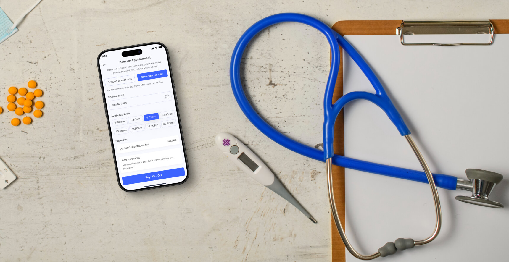
CareLink is a comprehensive health management platform that streamlines healthcare access by centralizing medical records, optimizing appointment scheduling and integrating telemedicine. . With a focus on accessibility and efficiency, it bridges the gap between patients and providers, empowering individuals to manage their health with confidence and ease.
Problem
Managing healthcare can be fragmented and overwhelming:
- Rural residents often struggle with limited access to healthcare providers and information.
- Urban professionals face challenges balancing tight schedules with their health needs.
- Medical records are scattered across clinics and hospitals, making tracking history difficult.
- Prescription adherence and wellness tracking are often neglected due to lack of integration.
Solution
- Access healthcare services regardless of location or schedule.
- Maintain a unified medical history with secure storage and sharing capabilities.
- Track prescriptions, wellness goals, and adherence seamlessly.
- Bridge the gap between patients and providers through telemedicine and real-time updates.
Design Process
I employed Design Thinking to craft CareLink, addressing challenges like complex booking and limited access through user research. Insights guided intuitive designs, refined through prototypes and usability testing, to deliver a seamless healthcare experience.
Competitor Analysis
I analyzed Helium Health, OneClickMed, and eClinicPlus, identifying gaps like limited patient engagement, lack of hybrid services, and absence of patient-centric features. These insights shaped CareLink as a comprehensive, user-focused solution.
Research
I conducted comprehensive user research employing user interviews, surveys, to gain a deep understanding of user needs and challenges. A total of 25 participants were selected, encompassing diverse age groups, occupations, and healthcare access levels.
The research questions aimed to uncover users’ pain points, habits, and expectations regarding healthcare management:
- How do you currently book appointments or access doctors? What challenges do you face?
- Are you comfortable using mobile apps for healthcare? If not, what are your concerns?
- What frustrates you the most about managing your health or accessing healthcare services?
- What tools or features would make healthcare management easier for you?
User Persona
I developed a comprehensive user persona to ensure CareLink addresses the diverse needs of its target audience. This persona represents a key demographic: individuals balancing personal healthcare management with caregiving responsibilities. By understanding their unique goals, challenges, and core needs, the persona provided critical insights to guide the platform’s design.
Sitemap
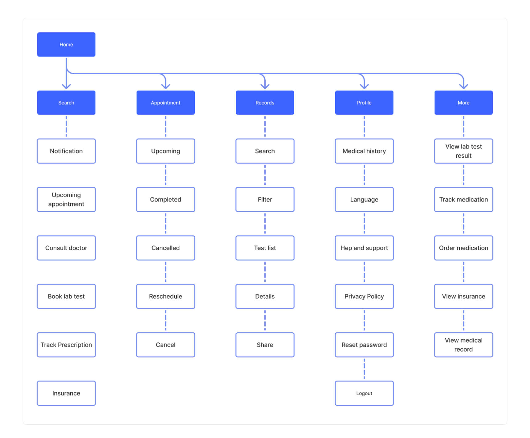
I designed a sitemap that structured features into logical categories: search and filters for refining apartment searches, map view for visualizing locations, listing details for comprehensive property information, and a user dashboard for managing favorites, applications, and messages, ensuring a seamless and intuitive user experience.
User Flow
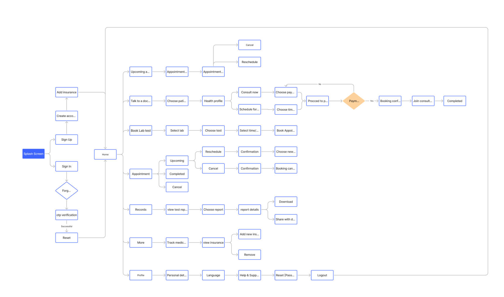
I developed a user flow to map the key actions users take, from searching for apartments and applying filters to viewing details and saving favorites. I identified entry points, charted decision paths, and optimized transitions for a seamless experience.
Design System
I created a design system for the apartment finder application, defining typography, colors, buttons, forms, and icons, along with layout and spacing guidelines. This ensured consistency, streamlined the design process, and provided a cohesive user experience.
Low Fidelity Wireframes
I went further to create low-fidelity prototypes to quickly visualize the app’s layout and user interactions. Using simple wireframes, I focused on key features and user flows, enabling rapid iteration and user feedback before moving to higher-fidelity designs.
High Fidelity Wireframes
I developed high-fidelity prototypes to refine the visual design and interactions of the apartment finder application. These prototypes incorporated the finalized design system, and interactive elements, allowing for detailed user testing and feedback to ensure a polished and intuitive experience.


Learnings
This project has significantly contributed to my growth as a UI/UX designer. Conducting interviews and surveys with students, staff, and prospective users provided valuable insights into their challenges, emphasizing the importance of user-centric design. This experience reinforced the value of empathy-driven design and the need for continuous iteration based on user feedback. Prioritizing user needs and ongoing improvements ensured the platform effectively met diverse requirements and enhanced the institute’s online presence.
